Leverage Documentation
Overview
The Leverage Add Logo and Favicon Module allows you to customize the branding for your site by adding logos, dark mode logos, favicons, and more. These visual elements enhance the look and feel of your website, ensuring consistency with your branding.
Instructions
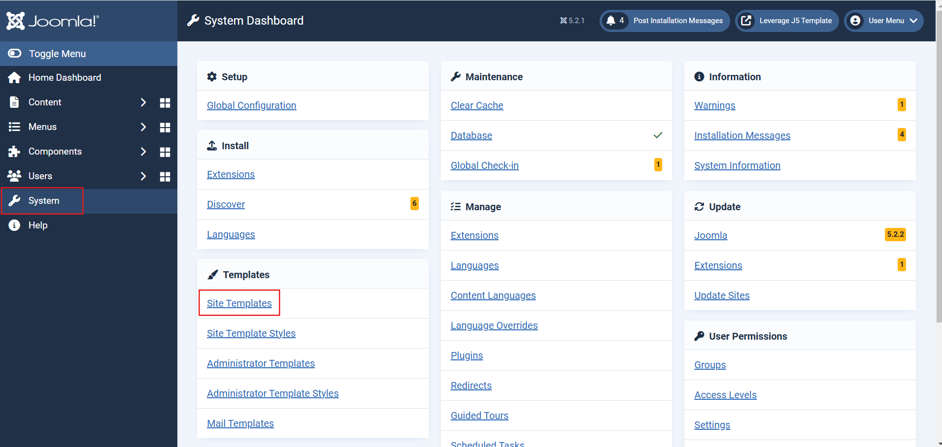
1. Navigate to Site Template Styles
- Go to
System > Site Template Styles. - Select the theme where you want to add or update the branding elements.
2. Access Settings Tab
- Select the Settings tab to configure additional settings for fonts, scroll buttons, and dark mode toggling.
-
Scroll Back to Top:
Enable or disable the scroll-to-top button functionality.- Options:
Show: Displays the button on your site.Hide: Disables the button.
- Options:
-
Typography (Heading and Body Fonts):
Specify the font families for your site's typography.- Heading Font: Enter the Google Font name for your site headings (e.g.,
Montserrat). - Body Font: Enter the Google Font name for body text (e.g.,
Montserrat).
- Heading Font: Enter the Google Font name for your site headings (e.g.,
-
Enable Dark Mode Toggle:
Add a button to toggle between light and dark modes.- Options:
Show: Enables the toggle.Hide: Disables the toggle.
- Options:

3. Access the Branding Tab
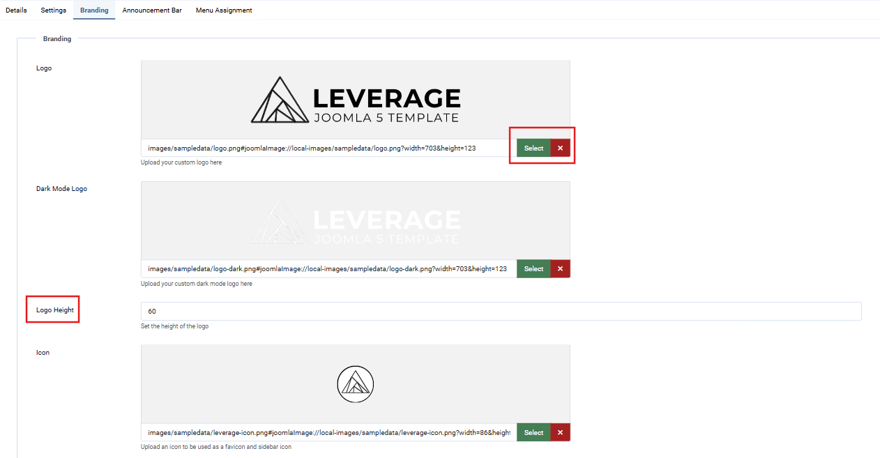
- After selecting the theme, click on the Branding tab.
-
Add a Logo / Favicon:
- Locate the "Logo" section.
- To add or change the logo:
- Click the red X next to the current image if one is present.
- Click Select to open the Media Manager.
- Upload a new logo or choose an existing image from the Media Library.
- Logo Height:
- Specify the desired height of the logo (default is
60px).
- Specify the desired height of the logo (default is
4. Customize Colors
- Adjust the branding colors in this tab:
- Text Color
- Background Color
- Accent Color
- Accent Hover Color
- Button Text Color
- Button Text Hover Color

Advanced Features
Announcement Bar
- Navigate to the Announcement Bar tab to add text for announcements (e.g., promotions or updates). Example:
“Free Shipping on orders over $50!”
Menu Assignment
- Use the Menu Assignment tab to apply these changes to specific menu items or sections of your site.

Lastly, Save and close the Module.
Overview
The Leverage Article Category Module displays a list of the most-read articles in a selected category, helping users engage with popular content.
Instructions
1. Add the Module:
-
- Navigate to
Extensions > Modules > New. - Select Leverage Article Category Module.
- Navigate to
2. Configure Module Settings:
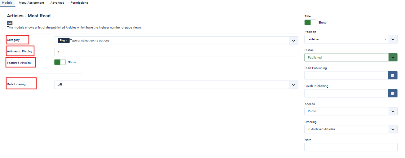
-
- Category: Select the article category you want to display.
- Articles to Display: Set the number of articles to be displayed (e.g., 4).
- Featured Articles: Toggle whether to include featured articles.
- Date Filtering: Choose a filter option for articles based on their published dates (e.g., Off, Today, This Month).
- Assign the module to a position (e.g.,
sidebar). - Set the Status to
Published.
3. Menu Assignment:
-
- In the Menu Assignment tab, assign the module to specific menu items or pages.

4. Advanced Settings:
-
- Caching: Select a caching option (e.g., Use Global).
- Module Class: Add custom module classes if required.
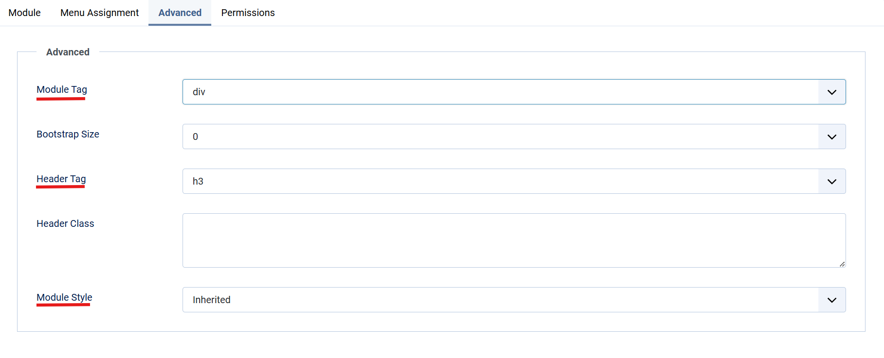
- HTML Tag Settings:
- Set the Module Tag (e.g.,
div). - Choose a Header Tag (e.g.,
h3). - Define additional Header Classes if necessary.
- Set the Module Tag (e.g.,
5. Permissions:
-
- Under the Permissions tab, configure user access:
- Allow or restrict actions like
Edit,Delete, orFrontend Editingfor specific user groups.
- Allow or restrict actions like
- Under the Permissions tab, configure user access:
Lastly, Save and close the Module.
Overview
The Leverage Counter Module provides an interactive and customizable counter display for the Leverage Theme. It allows you to display numbers, units, and custom text in a structured format.
Quick Setup Instructions
1. Add the Module:
-
- Navigate to Extensions > Modules > New and select the Leverage Counter Module.
2. Configure Module Settings:
-
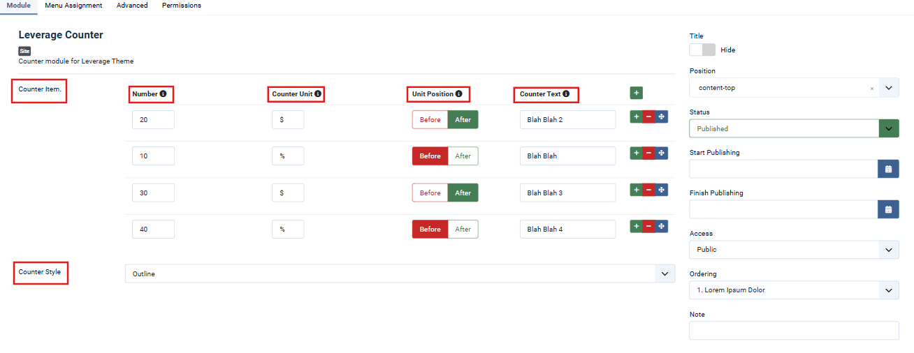
- Counter Items:
- Add individual counters by specifying the following:
- Number: Enter the numeric value (e.g., 20, 30).
- Counter Unit: Specify the unit (e.g., $, %, etc.).
- Unit Position: Choose whether the unit should appear Before or After the number.
- Counter Text: Add descriptive text for each counter.
- Add individual counters by specifying the following:
- Counter Style: Select a style for the counter (e.g., Outline).
-
- Assign the module to a position (e.g.,
content-top). - Ensure the module Status is set to Published.
- Assign the module to a position (e.g.,
-
- Counter Items:
3. Menu Assignment:
-
- Under the Menu Assignment tab:
- Assign the module to specific menu items or pages.
- Use the Expand the Menu Subtrees option for broader assignments.

- Under the Menu Assignment tab:
4. Advanced Settings:
-
- Modify the module’s HTML tag (e.g.,
div), header tag (e.g.,h3), and custom CSS classes for advanced styling. 
- Modify the module’s HTML tag (e.g.,
5. Permissions:
-
- Configure user permissions under the Permissions tab for actions such as editing, deleting, or accessing the module.
Lastly, Save and close the Module.
Overview
The Leverage FAQs Page is used to manage and display frequently asked questions dynamically, enhancing user experience with structured and easily accessible information.
Instructions
1. Create or Edit FAQ Page
-
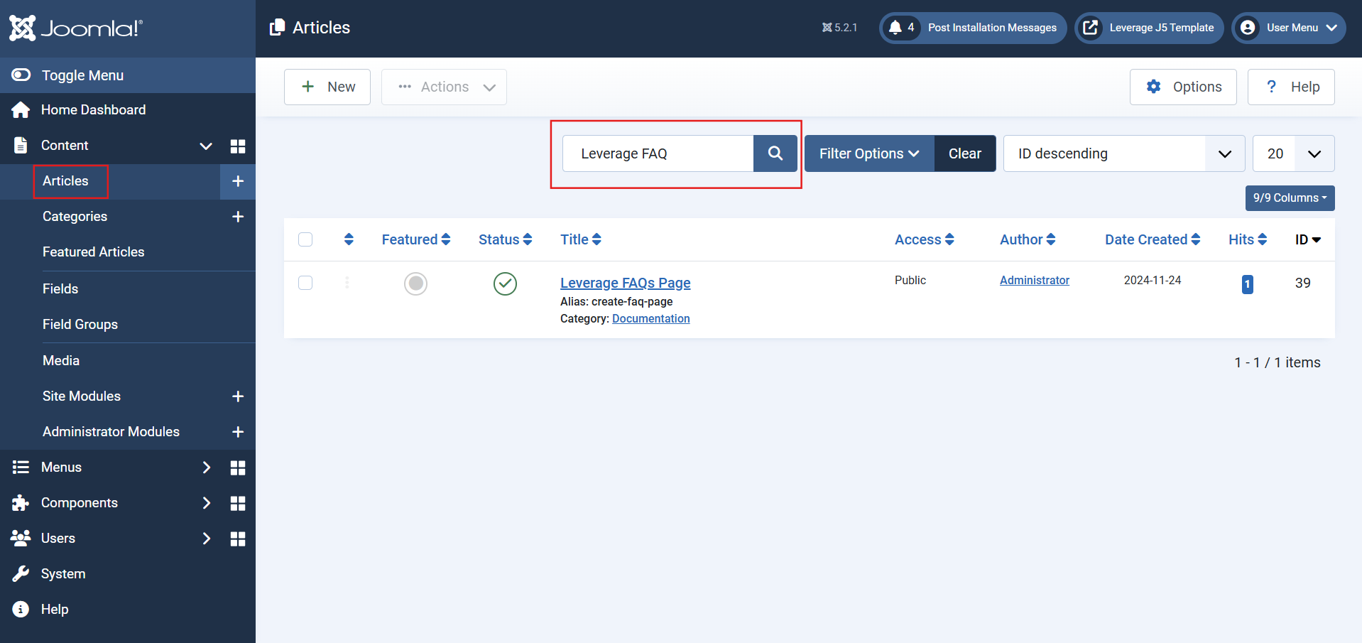
- Navigate to Content > Articles.
- Select an existing FAQ article or click New to create one.
2. Add Images and Links
-
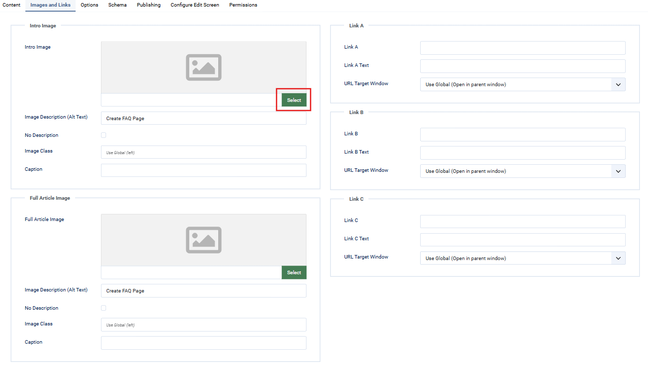
- Go to the Images and Links tab.
- To add an image:
- Click the Select button beside the "Intro Image" or "Full Article Image."
- This will open the Media Manager to choose or upload an image.
3. Adjust Article Options
-
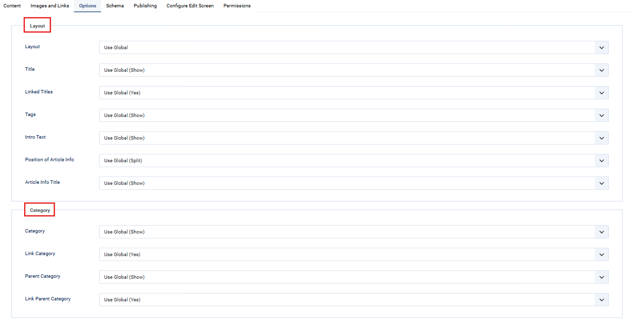
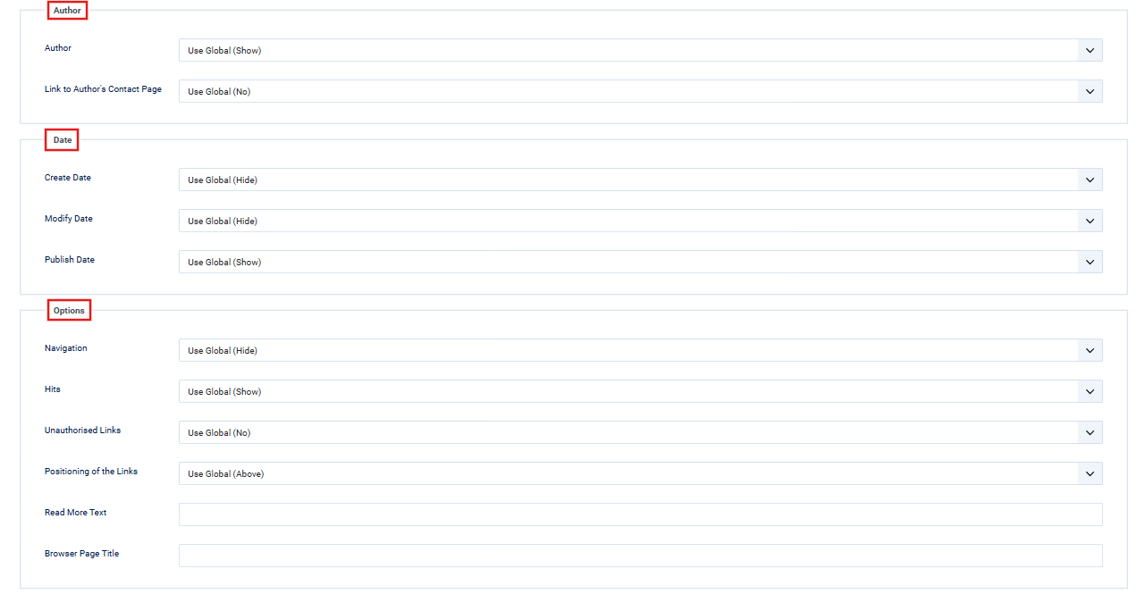
- In the Options tab:
- Configure layout, titles, tags, intro text visibility, and article information.
- Use the dropdown menus to customize visibility for categories, dates, and authors.
- In the Options tab:
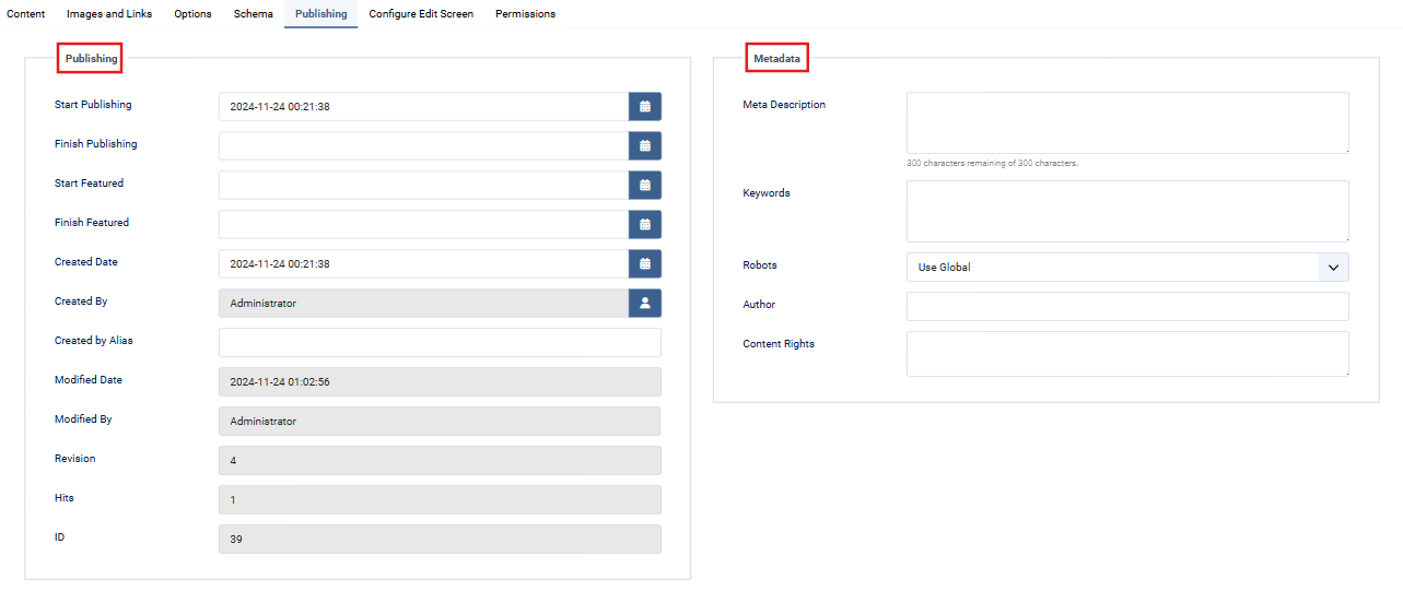
4. Manage Publishing Details
-
- Use the Publishing tab to set start and end dates for visibility.
- Add meta descriptions and keywords for better SEO.
5. Schema & Permissions
-
- In the Schema tab:
- Configure metadata for structured data (e.g., FAQ schema for SEO).
- Adjust Permissions to control access for user groups (e.g., Guest, Author, Editor).
- In the Schema tab:
Lastly, Save and close the Module.
Overview
The Leverage Flip Box Module allows you to display interactive flip boxes with customizable content, images, and styles, offering a dynamic way to showcase information.
Instructions
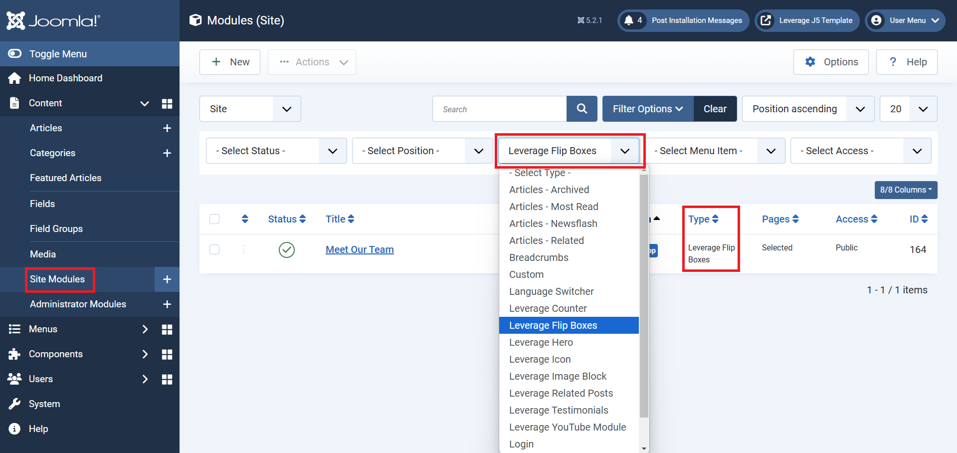
1. Add the Module
- Navigate to Extensions > Modules > New.
- Select Leverage Flip Box Module from the list.
2. Configure Module Settings
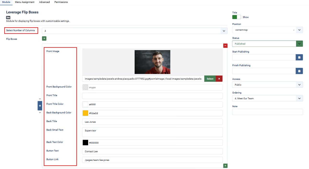
- Number of Columns: Specify the number of flip box columns (e.g., 3, 4).
- Front Image: Add an image for the front of the flip box.
- Front Title & Text Color: Input the title and customize its color.
- Back Title & Content: Add text for the back side of the flip box, including background and text colors.
- Button Text & Link: Specify a button label and a URL for the action button.
- Position: Assign the module to an appropriate position (e.g., content-top, sidebar).
- Status: Ensure the module status is set to Published.
- Access: Define the user access level (e.g., Public, Guest).
3. Menu Assignment
- Navigate to the Menu Assignment tab.
- Assign the module to specific pages using Module Assignment Rules:
- On all pages
- Only on selected pages
- Or other options as needed.

4. Advanced Customization
Advanced Tab
- Module Tag: Define the HTML tag for the surrounding container (default:
div). - Header Tag: Choose the header tag for the module title (default:
h3). - Header Class: Add custom classes for advanced styling.
- Module Style: Select a predefined style (e.g.,
AnimatedHeadingorsuperBasicMod) for added effects.

5. Permissions
- Navigate to the Permissions tab.
- Control who can view, edit, or delete the module by assigning permissions to specific user groups (e.g., Public, Registered, Super Users).
Lastly, Save and close the Module.
Overview
The Leverage Hero Module provides a customizable hero section for the Leverage Theme. It supports background images, text, and call-to-action buttons.
Instructions
-
Add the Module:
- Navigate to Extensions > Modules > New and select Leverage Hero Module.
-
Configure Module Settings:
- Hero Title: Enter the main heading text for the hero section.
- Hero Title Heading: Choose the heading tag (e.g., H1, H2).
- Title Font Size: Define the font size for the title (e.g.,
3rem). - Small Text Under Title: Add a subtitle or supporting text.
- Small Text Font Size: Set the font size for the supporting text (e.g.,
1.75rem). - Background Image: Upload or select an image for the background.
- Background Color: Choose a fallback color for the background.
- Primary/Secondary Button Text: Add text for the primary and secondary buttons.
- Primary/Secondary Button URLs: Provide the links for the buttons.
- Assign the module to a position (e.g.,
hero). - Ensure the module Status is set to Published.
-
Menu Assignment:
- Under the Menu Assignment tab, assign the module to specific menu items or pages.

-
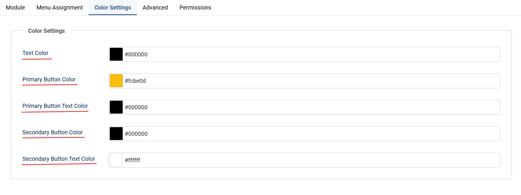
Customize Colors:
- Use the Color Settings tab to configure:
- Text Color: Set the font color for the text.
- Button Colors: Define background and text colors for both buttons
- Use the Color Settings tab to configure:
-
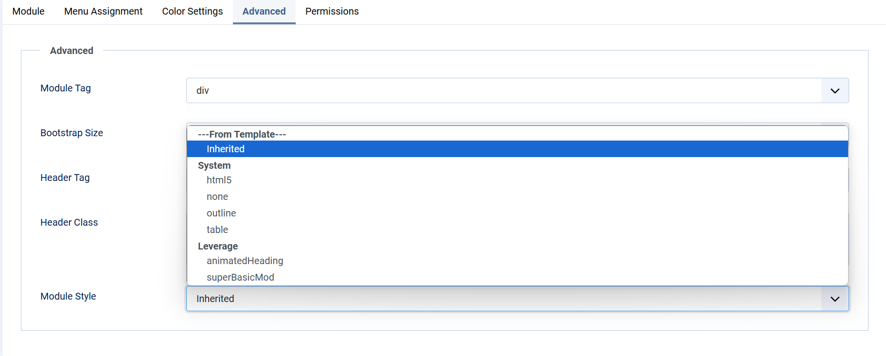
Advanced Settings:
- Modify the module’s HTML tag (e.g.,
div), header tag (e.g.,h3), and CSS classes for advanced customization. Additionally, selectAnimatedHeadingorsuperBasicModunder Module Style to apply effects to the module. 
- Modify the module’s HTML tag (e.g.,
-
Permissions:
- Configure user permissions for editing, deleting, and accessing the module under the Permissions tab.
Lastly, Save and close the Module.
Overview
The Leverage Icon Module allows you to display icons or images with customizable text and buttons, making it ideal for showcasing features or services.
Instructions
1. Add the Module:
-
- Navigate to Extensions > Modules > New and select Leverage Icon Module.
2. Configure Module Settings:
-
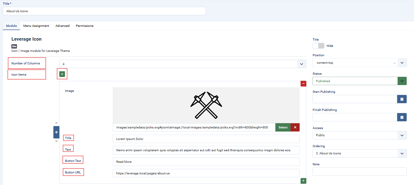
- Number of Columns: Set the number of columns for the layout (e.g., 4).
- Icon Items: Add items by clicking the + button:
- Image: Select an icon or image for the item.
- Title: Enter the title of the item.
- Text: Add a short description.
- Button Text: Enter button text (e.g., "Read More").
- Button URL: Specify the link for the button.
-
Position and Status:
- Assign the module to a position (e.g.,
content-top). - Ensure the module Status is set to Published.
- Assign the module to a position (e.g.,
3. Menu Assignment:
-
- Under the Menu Assignment tab, assign the module to specific menu items or pages.

4. Advanced Settings:
-
- Customize the module’s HTML tag (e.g.,
div), header tag (e.g.,h3), and CSS classes. 
- Customize the module’s HTML tag (e.g.,
5. Permissions:
-
- Configure user permissions for editing, deleting, and accessing the module under the Permissions tab.
Lastly, Save and close the Module.
Overview
The Leverage Image/Text Block Module allows you to display a block of images and text with accompanying call-to-action buttons. This module is part of the Leverage Theme and is perfect for creating visually engaging sections with flexible layouts.
Instructions
1. Add the Module
- Navigate to
Extensions > Modules > New. - Select Leverage Image/Text Block Module from the module list.
2. Configure Module Settings
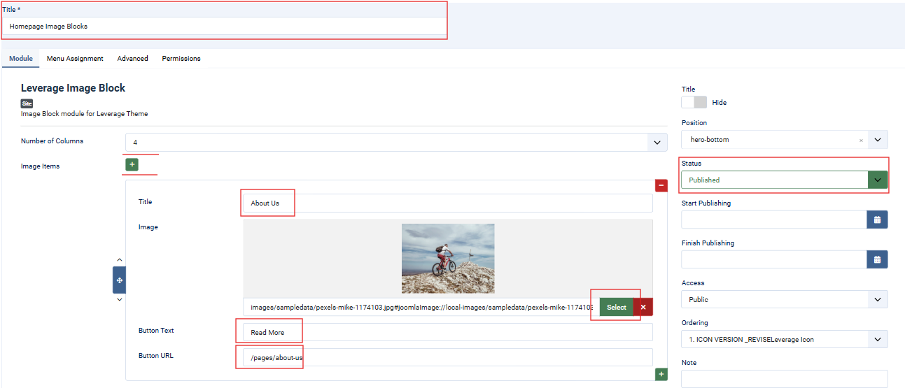
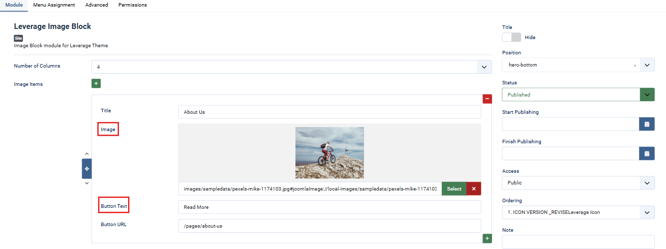
- Number of Columns: Specify the number of columns to display (e.g., 4).
- Image Items:
- Title: Provide the title or heading for the image block.
- Image: Upload or select an image to display.
- Text: Add supporting text or a description for the image.
- Button Text: Define the call-to-action button text (e.g., "Read More").
- Button URL: Add the URL the button should link to.
- Position: Assign the module to a specific position (e.g.,
hero-bottom). - Status: Ensure the module is set to
Published. - Access: Choose the appropriate access level (e.g., Public).
3. Menu Assignment
- Go to the Menu Assignment tab.
- Select specific menu items or pages where the module should appear.
- Use assignment rules like "Only on the pages selected" for precise control.

4. Advanced Customization
- HTML/CSS Adjustments:
- Module Tag: Define the surrounding HTML tag (default:
div). - Header Tag: Set the tag for the module's title (default:
h3). - Custom Classes: Add custom classes for advanced CSS styling.
- Module Tag: Define the surrounding HTML tag (default:
- Module Style: Choose pre-configured styles or inherit from the template.

5. Permissions
- Navigate to the Permissions tab to control module permissions:
- Configure user roles for editing, deletion, and access (e.g., Public, Administrator).
Lastly, Save and close the Module.
Overview
The Leverage Image Block Module is designed for the Leverage Theme, allowing users to create visually appealing image blocks with customizable titles, images, button texts, and URLs. The module supports multiple columns and is ideal for creating grids of linked content.
-
Access the Module:
- Go to Extensions > Modules > New > Leverage Image Block Module.
-
Configure Settings:
- Number of Columns: Set the grid layout (e.g., 4 columns).
- Image Items: Add blocks with:
- Title: Enter block title (e.g., "About Us").
- Image: Upload/select an image.
- Button Text: Add button label (e.g., "Read More").
- Button URL: Link the button to a page (e.g.,
/pages/faqs).
- Position: Assign to template positions (e.g.,
hero-bottom). - Status: Ensure Published.

-
Menu Assignment:
- Assign the module to All Pages or specific menu items.

-
Advanced Settings:
- Customize the Module Tag, Header Tag, and add optional CSS Classes.

-
Permissions:
- Configure user roles under the Permissions tab.
Lastly, Save and close the Module.
Overview
This module allows you to display menus dynamically within the page hero, providing quick navigation for users.
Instructions
1. Add the Module
- Navigate to Extensions > Modules > New.
- Select Leverage Menu Page Hero from the list.
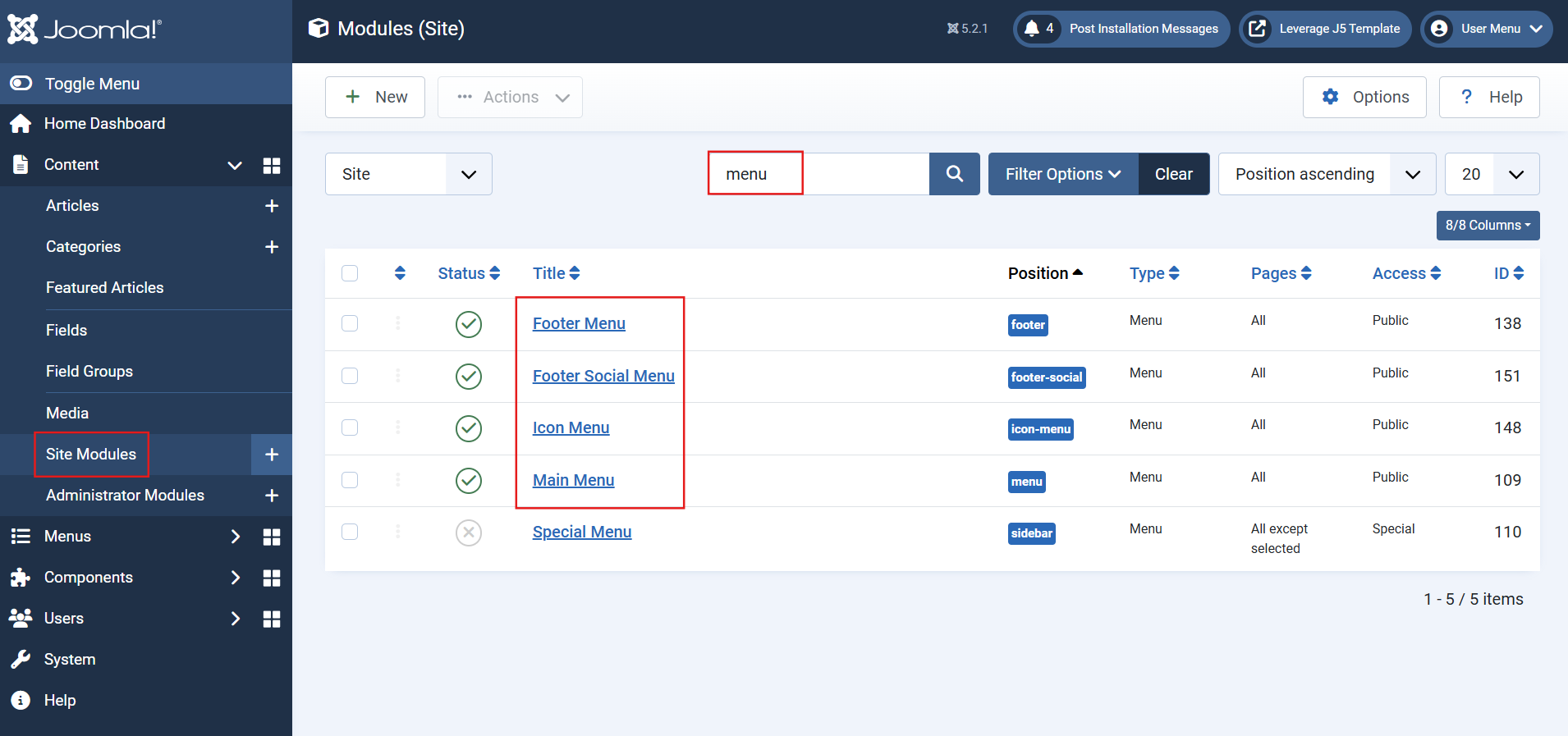
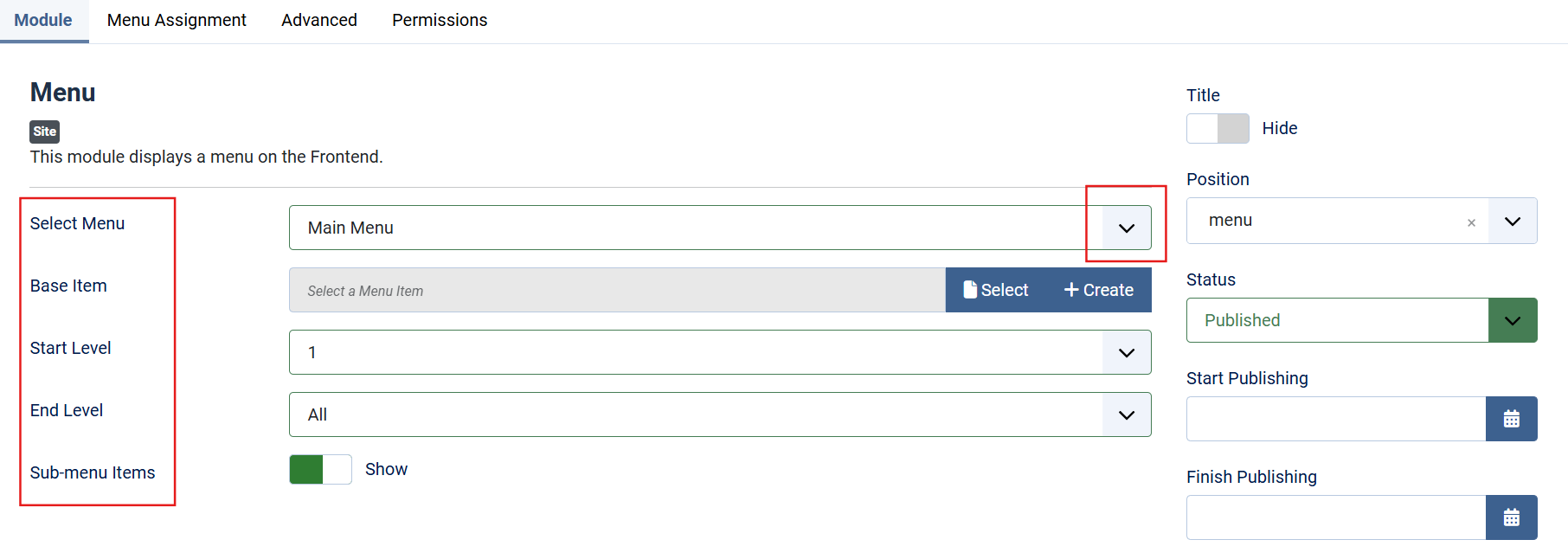
2. Configure Module Settings
- Select Menu: Choose the menu you want to display (e.g., Main Menu, Footer Menu).
- Position: Assign the module to an appropriate position (e.g.,
menu,footer-social). - Status: Ensure the module status is set to Published.
- Access: Define the user access level (e.g., Public, Guest).
3. Menu Assignment
- Navigate to the Menu Assignment tab.
- Assign the module to specific pages using Module Assignment Rules:
- On all pages
- Only on selected pages
- Or other options as needed.

4. Advanced Customization
-
Advanced Tab:
- Menu Class: Add a class for additional CSS customization.
- Module Tag: Define the HTML tag for the surrounding container (default:
nav). - Header Tag: Choose the header tag for the module title (default:
h3).
-
Styling Options:
- Utilize custom classes to style the menu uniquely within the page hero.

5. Permissions
- Navigate to the Permissions tab.
- Control who can view, edit, or delete the module by assigning permissions to specific user groups (e.g., Public, Super Users).
Lastly, Save and close the Module.
Overview
The Leverage Related Posts Module dynamically displays related posts based on shared tags, providing readers with relevant content suggestions to enhance engagement.
Instructions
1. Add the Module
- Navigate to Extensions > Modules > New.
- Select Leverage Related Posts Module from the list.
2. Configure Module Settings
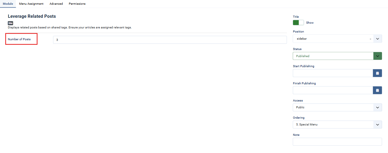
- Number of Posts: Specify how many related posts to display (e.g., 3).
- Position: Assign the module to an appropriate position (e.g.,
sidebar). - Status: Ensure the module status is set to Published.
- Access: Select the appropriate access level (e.g., Public).
3. Menu Assignment
- Go to the Menu Assignment tab.
- Select specific menu items or pages where the module should appear.
- Use "Only on the pages selected" or other assignment rules as necessary.

4. Advanced Customization
- HTML/CSS Adjustments:
- Module Tag: Define the surrounding HTML element (default:
div). - Header Tag: Choose a header tag for the module's title (default:
h3). - Module Style: Use pre-configured styles (default:
Inherited).
- Module Tag: Define the surrounding HTML element (default:
- Styling Options: Add custom classes for additional CSS customization.

5. Permissions
- Control editing, deletion, and access permissions in the Permissions tab.
- Assign permissions to user groups (e.g., Public, Administrator).
Lastly, Save and close the Module.
Overview
The Leverage Testimonials Module displays testimonials in either a grid or carousel layout, with customization options for categories, ordering, and view type.
Instructions
1. Add the Module:
-
- Go to Extensions > Modules > New, and select Leverage Testimonials Module.
2. Configure Module Settings:
-
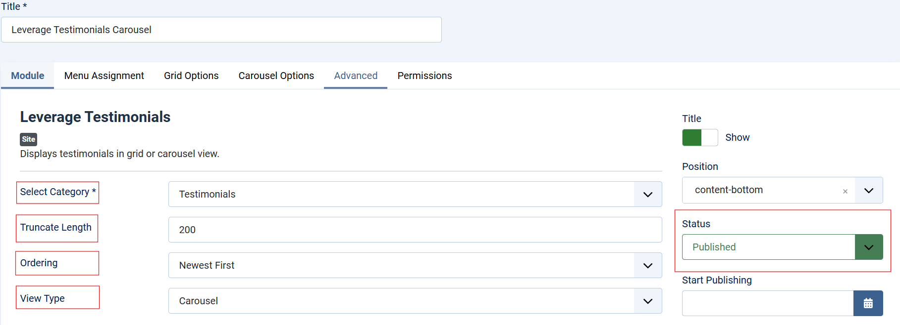
- Select Category: Choose the category to display testimonials from.
- Truncate Length: Set the maximum number of characters for each testimonial (e.g., 200).
- Ordering: Select how testimonials are displayed (e.g., Newest First).
- View Type: Choose between Grid or Carousel.
3. Grid Options:
-
- Number of Columns: Define the number of columns for the grid view.
- Number of Testimonials: Set the maximum number of testimonials to display.

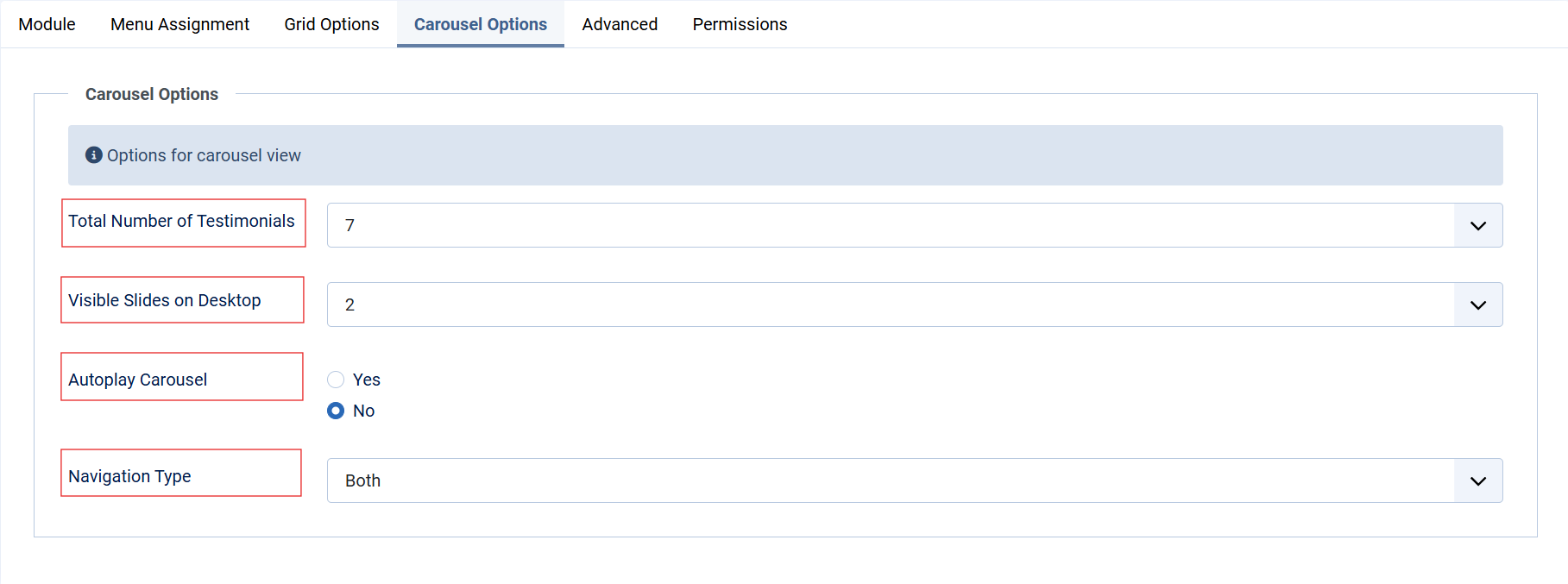
4. Carousel Options:
-
- Total Number of Testimonials: Specify how many testimonials to include in the carousel.
- Visible Slides on Desktop: Set how many slides are visible simultaneously.
- Autoplay Carousel: Enable or disable autoplay.
- Navigation Type: Choose between arrows, dots, or both.
5. Assign the Module:
-
- Under the Menu Assignment tab, assign the module to specific menu items or pages.

6. Advanced Settings:
-
- Modify HTML tags, add custom classes, and apply styles as needed.

7. Permissions:
-
- Configure user roles and permissions under the Permissions tab.
Lastly, Save and close the Module.
Overview
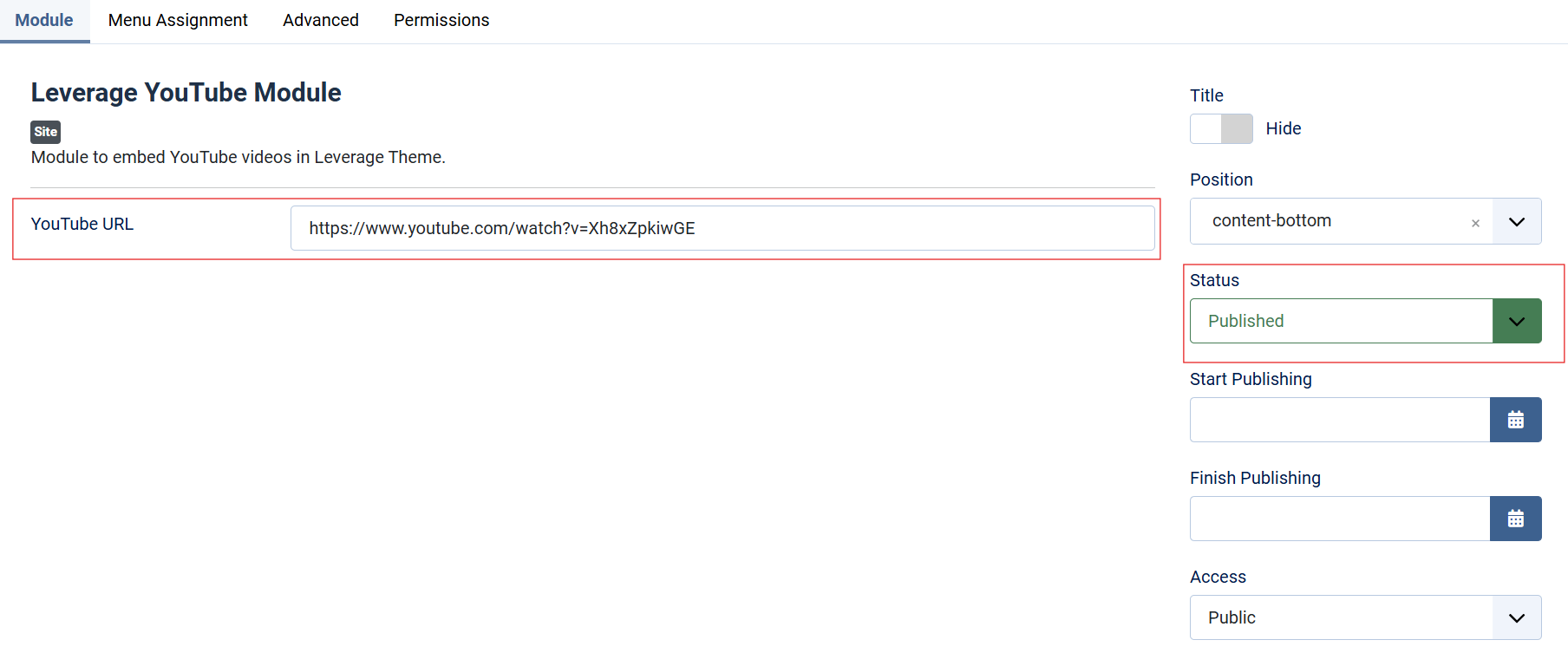
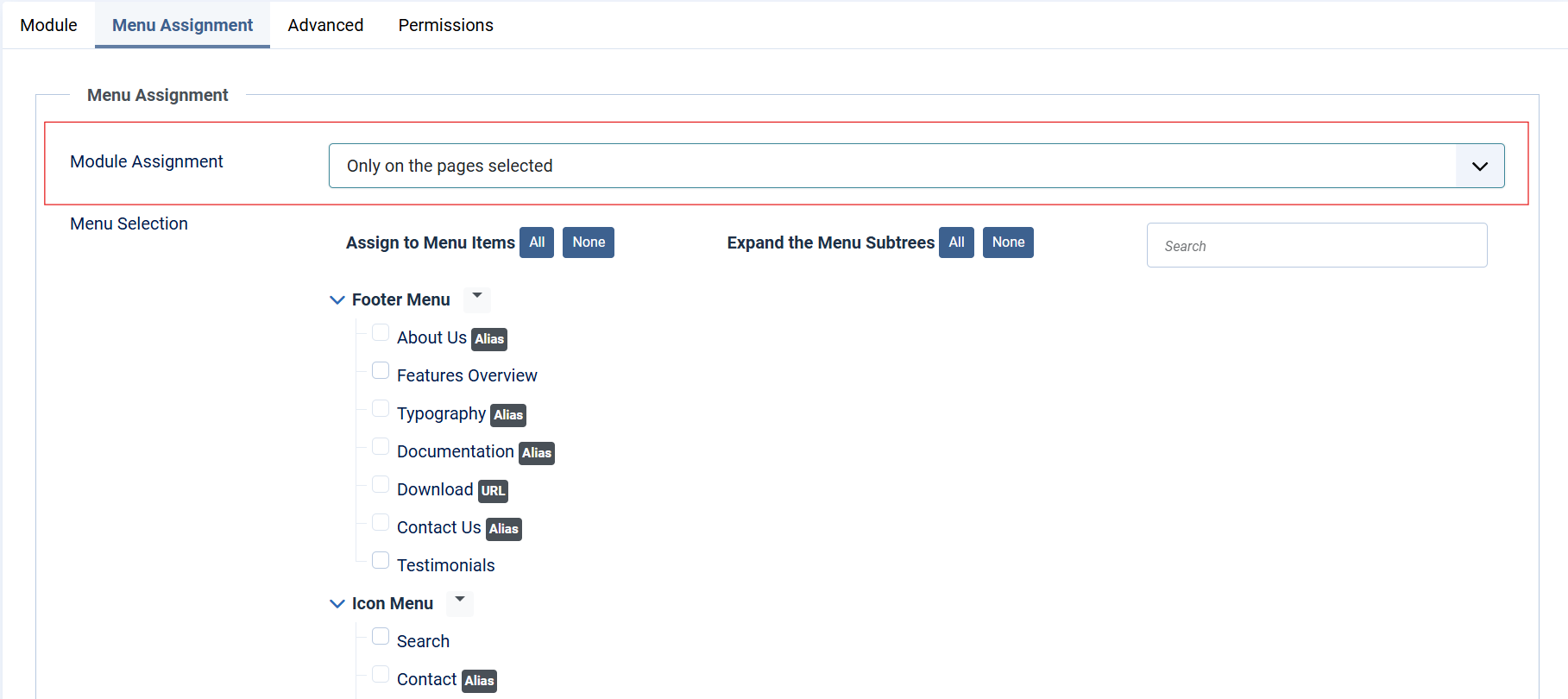
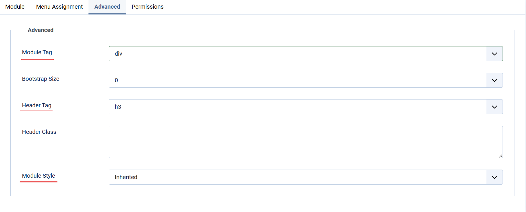
The Leverage YouTube Module is a Joomla module designed to embed YouTube videos into the Leverage Theme. This module allows users to integrate YouTube videos seamlessly by providing the video URL.
Overview
This setup allows you to create a modal login form that can be triggered by a menu item or link, providing a streamlined login experience for users.
Instructions
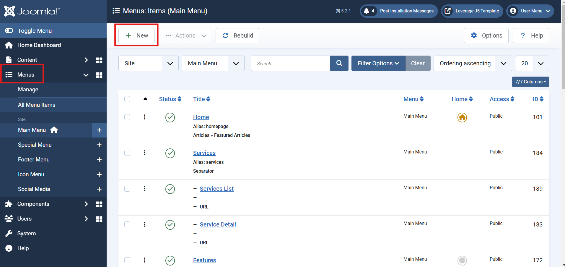
1. Add the Menu Item
- Navigate to Menus > Main Menu (or the menu you wish to use).
- Click on Add New Menu Item.
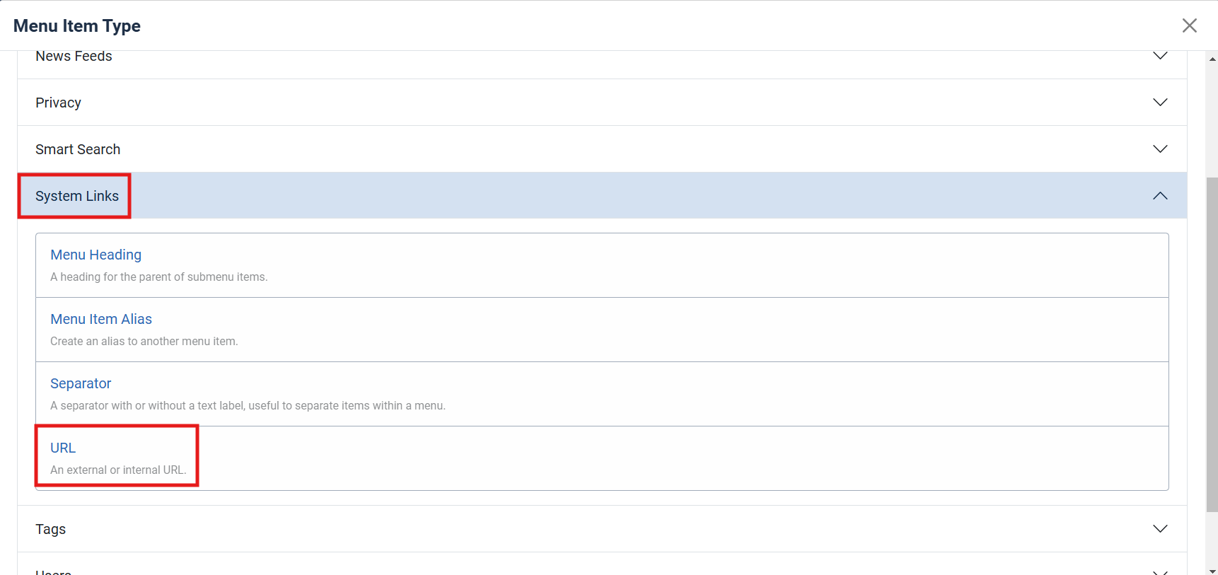
- Set the Menu Item Type:
- Select System Links > URL.
- Enter the Link:
- In the Link field, input
#login-modal.
- In the Link field, input
- Save the menu item.

2. Create the Login Form Module
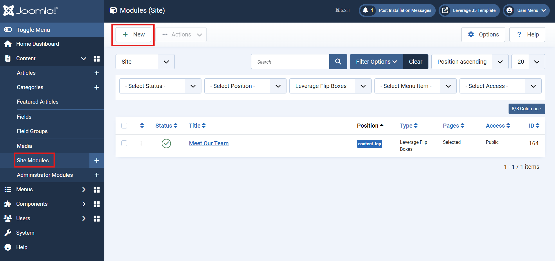
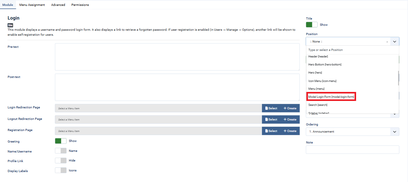
- Navigate to Extensions > Modules > New.
- Select Login as the module type.
3. Configure the Login Module Settings
- Position: Set the position to Modal Login Form [modal-login-form].
- Module Status: Ensure the module is set to Published.
- Access: Define the user access level (e.g., Public, Guest, Registered).
- Configure additional settings as needed, such as redirection after login, pre-text, or post-text options.
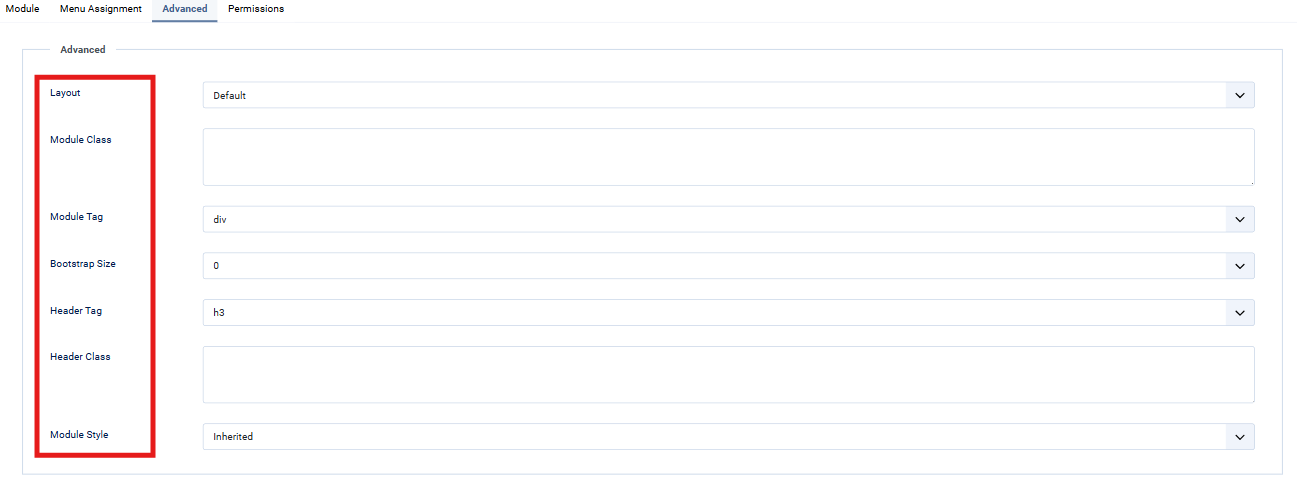
4. Advanced Customization
- Styling: Add custom CSS classes to the module to modify the appearance of the modal login form.
- JavaScript Effects: Enhance functionality with JavaScript to provide animations or custom behavior when opening and closing the modal.
Lastly, Save and close the Module.


